Generating User-Defined Chart Portlets
This section describes how to create user-defined chart portlets.
To generate a chart from a view
- In the local toolbar of the view, click Publish
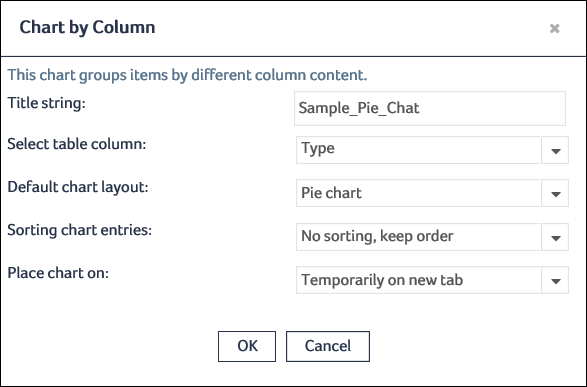
 Chart by Column.
 - Optional. Enter a title for the chart in the Title string field. This title helps the user to identify the newly created chart and avoid multiple charts with generic names.
- From the Select table column drop-down list, select the column that contains the data from which you want to generate the chart.
- From the Default chart layout drop-down list, select the type of chart that you want to use to display the data. These are the available values:
- Pie chart: A circle divided into slices to visualize proportions.
- Vertical bars: Vertically arranged rectangular bars of different lengths to visualize proportions.
- Horizontal bars: Horizontally arranged rectangular bars of different lengths to visualize proportions.
- Square chart: A square divided into smaller squares and rectangles of different sizes to visualize proportions.
- Text only: A list of the entries of the selected column with the number of times that entry occurs.
- From the Sorting chart entries drop-down list, select the sort order for the chart. These are the available values:
- No sorting, keep order: The chart entries are displayed alphabetically.
- Start with the smallest: The chart entries are sorted, beginning with the entry for which the fewest items exist.
- Start with the biggest: The chart entries are sorted, beginning with the entry for which the most items exist.
- From the Place chart on drop-down list, select where you want to display the chart. These are the available values:
- Temporarily on new tab: Displays the chart on a new tab. The chart is deleted when you close the tab.
- Temporarily on dashboard tab: Displays the chart on the Dashboard. The chart is deleted when you log off.
- Persistent on dashboard tab: Displays the chart on the Dashboard. The chart will remain on the Dashboard until you manually hide or delete it. This option is available only for the repeatable queries such as navigation Pathways, drill-down results from inventory counter, DQ trend charts, lineages, and so on. This option is disabled for Search results (Integrated Search, Search portlet, Search for Business Items portlet), guest users (no permission to write to preferences), and in Snapshot or WIP mode.
- Click OK to generate the chart.
- Click OK to close the message.
- Click OK to close the message.
The Chart by Column dialog opens:
If the selected column contains too many different values, a warning message is displayed that informs the amount of time required to process the request.

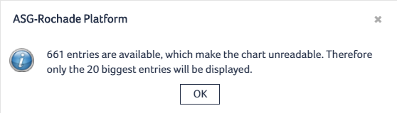
A message is displayed informing you that the chart will contain only the 20 most often occurring entries:
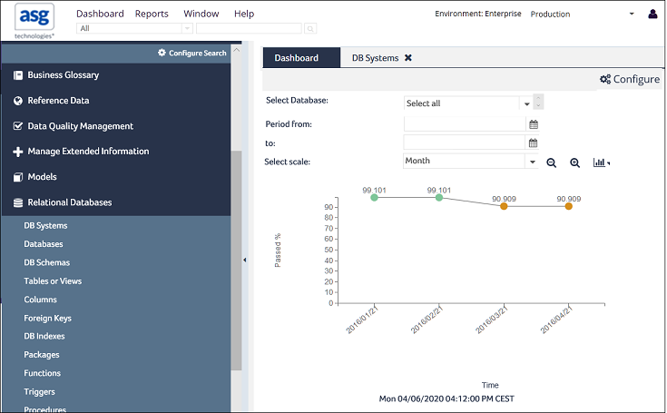
The generated chart displays:

For information on how to use the chart, see Using Chart Portlets.
To generate a DQ trend chart for a selected item
- Navigate to a view that contains the item for which you want to generate the chart.
- Right-click the item, and select Create DQ Chart from the context menu.
- Specify these settings for the trend chart:
- From the drop-down list at the top of the dialog, select whether you want to display the trend data for a particular child item.
- From the Period from and to drop-down lists, select the time period that you want to consider in the chart.
- From the Select Scale drop-down list, select the scale for the chart such as week, month, quarter, or year.
- From the Place chart on drop-down list, select whether you want to create the chart temporarily on a new tab or temporarily or permanently on the dashboard.
- Click OK to create the chart.
The DQ Trend Chart dialog opens:

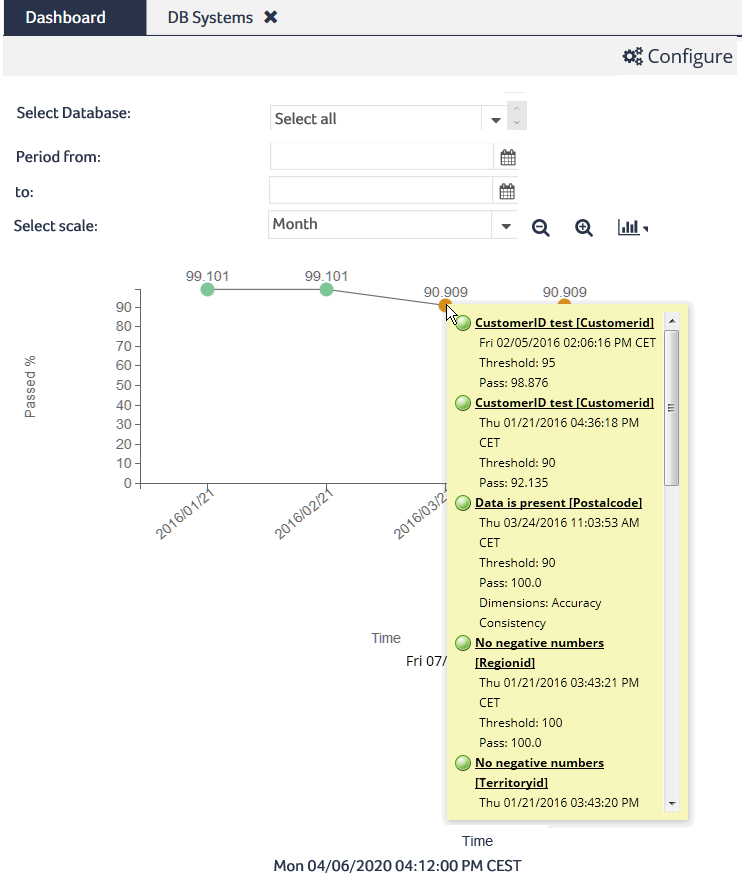
The new chart opens in the selected location, listing the changes in the item’s data quality metrics over the selected period of time:
You can display detailed information about the data quality measures that have been considered in the calculation of a metric by clicking that metric in the chart: